Mini Post #12: Temporarily Embarassed
Do official poverty statistics accurately measure who is poor and when?
Recently, I’ve been writing a shorter, narrower post focusing on one specific paper once a week. Last week (technically two weeks ago but I’ve had a lot of work recently), I wrote about whether forgiving people's medical debts helps their finances. This is the tab with all the previous (and current) posts.
Onto the actual post: do official poverty statistics accurately measure who is poor at the time they are poor?
There has been, at least since the 19th century, a general consensus that “poverty” means having insufficient resources for an acceptable standard of living, though with disagreements over the meaning of both of those concepts. Poverty, which is considered relevant to socioeconomic health, is typically measured by comparing household income to a threshold, and it is done so on a normally annual basis.
This opens at least three complex theoretical questions: first, how should the poverty line be set? Secondly, how can levels of deprivation across different socioeconomic aspects (income, consumption, healthcare, education, infrastructure) be aggregated? Thirdly, how can poverty measures aggregate individuals across time?
Most common definitions don’t account for the fact that the incomes of the poor are also very variable - so it could be possible that someone be poor for part of the year but not others (for example, if local businesses employ more people at a certain time, but don’t retain them). This effect is especially prevalent in poor countries: firstly, because statistics are much lower quality, as they are available either yearly or for very long periods of time - on average, low income countries produce such data every seven years. Secondly, a higher proportion of agricultural and rural labor, coupled with overall higher levels of labor informality, means that income is much more variable and fluctuates more sharply.
A recent paper, titled Poverty at High Frequency (2022) by Joshua Merfeld and Jonathan Morduch, aims to find how pervasive this distortion is. The question the researchers are aiming to answer is whether poor people are consistently poor, or whether the effects of unstable and variable income place them across different levels of poverty for different times of the year.
To do this, the authors utilize panel data from rural India, and create monthly measures of poverty for each of a group of 945 households and then aggregates them into annual figures. They construct quite a unique method of aggregation: first, each household’s standard poverty line (income versus some officially designated basket of goods) at every month of the year. Then, the annual poverty measure is constructed by aggregating every household across each month - so, for example, if a family is poor for 9 out of 12 months of the year, they would have an annual poverty level of 0.75, and therefore be counted as such for the aggregate annual measure. This also permits accurately evaluating how a policy intervention reduces poverty: does it reduce poverty in every period, or does it permit households who are not poor in certain parts of the year to not be poor in others.
This new measurements has several implications: firstly, to clarify whether changes in the poverty rate come from boosting incomes in the “poor season”, the “rich season”, or across the year; whether interventions should target certain groups of people in certain ways; and whether poverty alleviating measures actually permanently reduce someone’s level of poverty, or simply shift the poor and rich seasons around.
The data to construct this measurement comes from a group of roughly 1500 families in the Indian desert from 2010 to 2014, as part of an observational group that measures income, consumption, and other relevant economic variables for them. The authors also measure size of the household, living conditions (such as whether they own their land), and key demographic variables (gender, ethnicity, etc) alongside other relevant indicators on an annual basis. Income shows clear and consistent variability across the year, while expenditures do not.
Onto the results: annual poverty measures show that 29% of households are poor, whilst the high frequency measure finds that 37% of all households spend the equivalent months in poverty. Adjusting for purchases and ownership of durable goods, this measure drops to 35% of household-months. And the portion of households who spend at least one month in poverty is 57% (after adjustment). While 71% of the sample is coded as non-poor for the year, those households spend around 2 months in poverty - compared to 8 months from the poor households (by the annual measure). Likewise, 63% of the sample is poor at least one month of the year, owing to 100% of the 29% that are poor, plus 47% of the non-poor households. Around 35% of poverty-months are attributable to households that would normally be considered non-poor by annual measures.
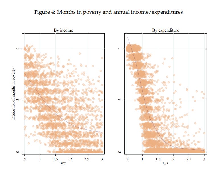
Now onto poverty exposure: this measure quantifies how many months of poverty a household suffers, relative to their income or expenditures as a % of the poverty line. Put another way, the question is whether households who are less affluent spend more months in poverty, and what shape this relationship takes. Surprising nobody, poverty exposure is lower as income rises, but the relationship is much tighter for spending than for income - due to the sharp variations mentioned above. On average, families are poor for around 60% of the year right at the poverty line, which drops to 24% of the time at 150% of the poverty lien, and just 7% at twice the poverty line. Additionally, if we define a “poverty spell” as lasting at least two months, around a quarter of non-poor families (by the annual measure) experience such a thing.
Now let’s look at households classified by educational level of the head of household: less than primary education, completed primary but not secondary education, and completed secondary or higher education. The question is whether households with more educated heads are able to spend more months out of poverty. They study this by regressing household spending by fixed village-level, year-level, demographic and household effects, and an interaction between education of the head of household and family income - the idea is that a null term in this interaction would mean all families manage to smooth their consumption across the year, while a positive value would imply the opposite.
This is, obviously, what is found by the authors: income has a significant effect on consumption (of the logical, positive sign), and the coefficient is around a third smaller for the most educated households versus the least educated ones. Because poverty is higher for less educated homes, but still prevalent for educated ones, then all households are qualified as spending some amount of months on income-based poverty - but consumption level measures are substantially lower for educated households (41% versus 25%) and this difference is very statistically significant.
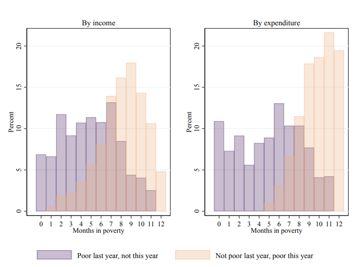
If we look at whether households who were poor last year but are not this year, and viceversa, we find significant overlap across months for both groups: while the expectation is that the typical ex-poor family would spend 0 months in poverty this year, and the typical ex-non-poor household would spend 12, the truth is that around 95% of either group spend at least one month in income based poverty, and 90% in consumption based poverty. Almost 60% of people who become poor (consumption-based) are classified as poor for nine months and more, and not one of them has a shorter poverty spell of under five months.
Now, for a policy implication. The authors imagine what would happen if they transferred 960 rupees per year to people, which is approvimately 7% of the average spending per capita of the sample, or 14% for the poor section. Assume households receive this money in full and spend all of it. The authors also imagine staggering the transfers such that the households receive either a monthly sum of 80 each months, 160 rupees a month for six months (and nothing else in the other six), or 320 per month for three months. They assume that the entire sum is consumed during the month(s) it is transferred in. Compared to a counterfactual with no transfer, the authors find that the three implementations all reduce poverty, but with different magnitude impacts: the monthly transfer rupees decreases poverty by 14% percent (12 percentage points), whilst making the transfers across three months per year decreases poverty by 19.1 percent (16 p.p.), and transferring six months in and six months out lowers poverty by 11 percentage points (13%). However, alternative poverty measures that emphasize how poor the households classified as poor are show that the monthly transfers perform just as well, if not better, than the three-month emphasis.
Put together, this paper has three core findings: that the timing of poverty matters for policy and for analysis, that there are substantial movements into and out of poverty across the year, and that the timing of government transfers should account for the poorest months of the year.
To finish the post, some links
The paper in question
A 2016 World Bank blog post by Azevedo & Seitz on whether poverty is seasonal
A 2016 World Bank blog post by the same authors on how persistent poverty is in the short run, summarizing research from 2014 by Martin Biewen
A 2018 study by Zuhumnan Dapelon at CGDev on transitions into and out of poverty in Nigeria
A 2015 study by Jonathan Parker on why (otherwise affluent) families don’t smooth income throughout the year
A 2020 paper by Ganong et al. on how volatile income is for American families, and whether this changes across racial groups
A 2021 study by Balboni et al. on whether giving poor families in Bangladesh cows helps them out of poverty, and why
A 2024 study by Laguinge, Gasparini, and Neidhöfer on the impact of Brazil’s Bolsa Familia cash transfers on family outcomes
A writeup of their research by the British Investment Institute on when economic growth reduces and does not reduce poverty


Really cool read. As a non-economist, I often wonder how much of the simplified view of the economy I walk around with in my head is actually shaped by dynamics that hide in statistical aggregates, whether it's composition effects (average wages fell! oh wait, it was because some high earners retired) or data that is not sampled at a granular enough level to understand the whole story (such as this paper).
Is there anything like this analysis for the US?